There was double the fun at the Museum of Contemporary Art Denver (MCA
Denver) on Friday night, with the openings of two exhibitions from two
contemporary Denver artists: Joel Swanson and Ian Fisher. The museum
galleries buzzed with a consistent and excited crowd, all coming out to
celebrate these two talented locals. The combination of these
shows - one an interactive exhibit that keeps people moving through the
galleries (Swanson), the other a reflective and peaceful exhibit
inviting guests to stand and ponder - gave the audience a varied
experience.
Swanson, a 36 year old Chicago-born artist, designer and writer, currently lives and works in Denver while also serving as Director of the Technology, Arts
& Media Program at UC, Boulder. His show at the MCA, Joel Swanson: Left to Right, Top to Bottom, which runs through March 30th of this year, has some great sculptures, photographs and installations that enables the viewer to discover new meanings of everyday words and symbols. The artist keeps you moving, thinking, laughing, questioning and learning in a way that makes you think twice about the English language and how we communicate.
 |
Joel Swanson, Logic Only Works in Two Dimensions, 2014
Fabricated Aluminum and steel cable |
|
Drawing upon linguistics and conceptual art theories from the 1960's, Swanson's sculptures and installations bring to light the complexities and ambiguity of language in modern times. His inspiration is found in that of familiar symbols, phrases and grammar; his creative process made relevant by today's technology focused and digitally driven society. Furthermore, what makes his work so successful is the way his works bring the viewer into his explorations. For example, Logic Only Works in Two Dimensions (2014) - a sculpture made of fabricated aluminum and steel cable that dangles a large-scale greater-than/less-than symbol rotating just a few feet above the floor - places the viewer in an important position of translating the symbol's meaning depending on where he or she is standing. While the "<" and ">" symbols represent the inequality between two numbers or expressions in mathematics, they also have a place in the English language as well as in the language of computer programming. Thus, Swanson points towards the dichotomy between the two symbols, ultimately revealing the fact that the meaning of a symbol can refer to it's exact opposite, and that "translation" isn't as black and white as our own understanding of communication leads us to believe. To watch a video of this piece, click here.
 |
| Joel Swanson, t/here (2013), neon, 8" x 30" |
Another highlight of Swanson's show was his piece titled "Homophone" (2013), a wall installation with a holographic surface that reads the words "right," "write," and "rite" depending on where the viewer is standing. While a homophone is a word that is pronounced the same
as another word but differs in meaning, the piece illustrates Swanson's
motivation to complicate the relationship between the images we see and
the text that we read. I found Swanson's attempt to mess with the viewer to be playful as it encourages guests to move around the work to eye it from different angles. These
motivations are what drive Swanson's creativity, and I must say, his
aims are achieved through this process, keeping conceptual art
stimulating and leaving us wanting more of his brilliance.
 |
Ian Fisher, Atmosphere No. 50 (Follow you into the Dark), 2014
Oil on Canvas |
Just about the same age as his contemporary, Ian Fisher was born in the 80's in Nova
Scotia, Canada, transplanting to Colorado to receive his BFA from the
UC Boulder in 2006. Living and working in Denver, Fisher is currently
represented by Robischon Gallery in the city's LoDo district. His show at the MCA, titled Critical Focus: Ian Fisher,
on view through April 13, 2014, is the artist's first solo museum
exhibition and highlights his continued exploration in painting and his
interest in clouds and skyscapes as subject matter.
Fisher's oils on canvas are large in scale, bringing his beautiful imagery face to face with the viewer with a "zoomed-in" effect. Despite painting on a two dimensional surface, Fisher's skilled hand creates so much movement that you feel as though you could be pulled from the room in which you stand and float into the dreamy, atmospheric space before you. By using photographic documentation as his source material, the artist is able
to produce a snap-shot in time, allowing us to revel in quiet
reflection.
 |
| Ian Fisher, Atmosphere No. 34, 2011, Oil on Canvas |
With their bold colors, which are somewhat abstract in form, these paintings are quite powerful and evoke feelings of mystery, awe, and nostalgia. Bringing to mind Michelangelo's ceiling of the Sistine Chapel, there seems to be some cognizance of the Almighty above which pervades many of the works in this show. Who knows if that is Fisher's intention or not - maybe it's just my own nostalgic feelings while experiencing the work. Nevertheless, I found this to be an impressive quality of his work. Also impressive (maybe even more so) is the fact that Fisher is able to dodge the kind of "kitschiness" that this imagery is so often be characterized by.
For more information on these two artists, visit TANK Studios where both Swanson and Fisher are members of here in Denver. Also be sure to check out MCA Denver's website to learn more about their current exhibits, as well as their Facebook page where you'll find more pictures and installation shots of both shows.
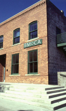
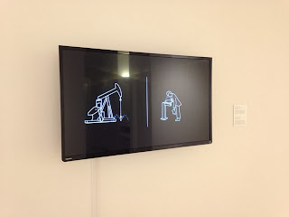
 A great little show at Boulder Museum of Contemporary Art (BMoCA) just ended this past week, titled Craft Tech / Coded Media: women, art & technology.
The show was curated by Deanne Pytlinksi, a professor of Art History,
Theory and Criticism at Metropolitan State University in Denver.
Pytlinksi has always been interested in gender and video art throughout
her career, having wrote her dissertation on the subjects, and continued
to examine the role of gender in technology in this exhibition. Through
the lens of contemporary female artists, some of whom were early
pioneers of video art and multi-channel installations, Pytlinksi seeks
to question the relationship between gender and technology in an
increasingly digital age. Below are some highlights I found particularly
interesting.


